Components
Steps
Step states
The steps can have different states by applying the following classes.
- Default
- Disabled
- Active
- Default
<ul class="tangram steps">
  <li class="step">
    Default
  </li>
  <li class="disabled step">
    Disabled
  </li>
  <li class="active step">
    Active
  </li>
  <li class="step">
    Default
  </li>
</ul>
Steps with links
It's possible to use an anchor tag inside the step for allow the user to navigate directly to another step.
<ul class="tangram steps">
  <li class="step">
    <a href="#">Link 1</a>
  </li>
  <li class="disabled step">
    Disabled
  </li>
  <li class="active step">
    Active
  </li>
  <li class="step">
    <a href="#">Link 2</a>
  </li>
</ul>
Clickable step (for Javascript)
The .clickable class is meant to be used when the navigation is made redirecting
the user using Javascript.
- First
- Clickable
- Third
<ul class="tangram steps">
  <li class="step">First</li>
  <li class="clickable step ">Clickable</li>
  <li class="active step">Third</li>
</ul>
Responsive design
When using .collapse-on-600, .collapse-on-700,
.collapse-on-800, .collapse-on-900 or .collapse-on-1000
the steps collapse when the viewport if narrower than the correspondent class width. Use it to give more space to adjacent buttons.
- Default
- Disabled
- Active
- Default
<ul class="tangram steps collapse-on-1000">
  <li class="step">
    Default
  </li>
  <li class="disabled step">
    Disabled
  </li>
  <li class="active step">
    Active
  </li>
  <li class="step">
    Default
  </li>
</ul>
Component image
Concept
Use the step component to guide users through steps or sequence of screens to complete a task. This component must display the title/label of each step of the process and in which step the user is at that time.
The steps component should be used for complex, multi-step tasks or screens that need to be completed in a predetermined order. Flows that require insertion / manipulation of information in several steps, such as the flow of creation of a landing page, email marketing, form, etc. are strong candidates to use this component.
If you need to create a stream that involves many users actions to manipulate a record or a very large volume of data, consider breaking it down into smaller steps using this component to guide the user. By using the steps component, you will reduce the cognitive load required to complete a big task.
Interactions
Each step has the possibility of being clickable or not depending of the situation.
For example: the landing page publishing step is the last one of the landing page creation flow. This step depends on the completion of one or more previous steps, in this example, the configuration step. In this scenario, moving directly to the publishing step does not make sense. The only step that allows interaction is the clickable step.
States
There are four possible states.
- Default
- Disabled
- Clickable
- Active
Default
It's a step which the user must complete or have already completed but, for some reason, can't be accessed at the moment. It's a step that depends of other previous steps to be completed.
Disabled
Is a flow step that has already been completed and can no longer be accessed. For example: In the email flow, the template selection is made in the first step and it is not possible to return once it is completed.
Clickable
Clickable steps are the ones which the user can click to access it directly from other step of the flow.
Active
It's the current step of the flow.
Responsive design
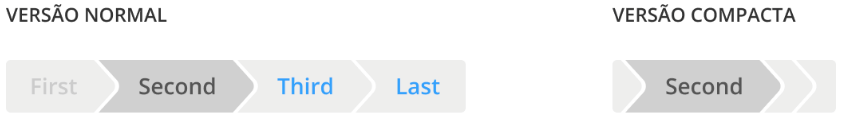
Different presentations
The component has two different presentations. In its default version, it presents all the steps expanded with the label. In the compact version, only the current step is displayed with the label. All the others steps are shown collapsed without label and any form of interaction.
Expanded

Compact

Good practices
- If a task requires many steps (more than 5), consider simplifying the flow or breaking the task into smaller parts;
- Pay attention to the clarity and the length of the step labels. Use preferably 1 or 2 words. Examples: "Profile", "Your data", "Edit", "Publish ad", "Templates", etc .;
- Remember to use navigation buttons to step back and forth, especially if you are using the builder framework (how to create landing pages, emails, etc.);
- Pay attention to the compact version of the steps component. In it, the steps have no links and only the current step is displayed with the label. This is a very common use case to happen, which happens at lower resolutions;